How I wish someone would explain SHAP values to me

Have you ever struggled to interpret the decisions of an AI? SHAP was created to help you overcome these issues. The acronym stands for SHapley Additive exPlanations, a relatively recent method (less than 10 years old) that seeks to explain the decisions of artificial intelligence models in a more direct and intuitive way, avoiding “black box” solutions.

Its concept is based on game theory with robust mathematics. However, a complete understanding of the mathematical aspects is not necessary to use this methodology in our daily lives. For those who wish to delve deeper into the theory, I recommend reading this publication in English.

In this text, I will demonstrate practical interpretations of SHAP, as well as understanding its results. Without further ado, let’s get started! To do this, we’ll need a model to interpret, right?

I will use as a basis the model built in my notebook (indicated by the previous link). It is a tree-based model for binary prediction of Diabetes. In other words, the model predicts people who have this pathology. For the construction of this analysis, the shap library was used, initially maintained by the author of the article that originated the method, and now by a vast community.

First, let’s calculate the SHAP values following the package tutorials:

				
					# Library
import shap

# SHAP Calculation - Defining explainer with desired characteristics
explainer = shap.TreeExplainer(model=model)

# SHAP Calculation
shap_values_train = explainer.shap_values(x_train, y_train)


Note that I defined a TreeExplainer. This is because my model is based on a tree, so the library has a specific explainer for this family of models. In addition, up to this point, what we did was:

  • Define an explainer with the desired parameters (there are a variety of parameters for TreeExplainer, I recommend checking the options in the library).
  • Calculate the SHAP values for the training set.

What are SHAP values?

With the set of SHAP values already defined for our training set, we can evaluate how each value of each variable influenced the result achieved by the predictive model. In our case, we will be evaluating the results of the models in terms of probability, i.e., the X percentage that the model presented to say whether the correct class is 0 (no diabetes) or 1 (has diabetes). 

It is worth noting that this may vary from model to model: If you use an XGBoost model, probably your default result will not be in terms of probability as it is for the random forest of the sklearn package.

To make the value in terms of probability, you can define it through the TreeExplainer, using parameters.

But the burning question is: How can I interpret SHAP values? To do this, let’s calculate the prediction probability result for the training set for any sample that predicted a positive value:

				
					# Prediction probability of the training set
y_pred_train_proba = model.predict_proba(x_train)

# Let's now select a result that predicted as positive
print('Probability of the model predicting negative -', 100*y_pred_train_proba[3][0].round(2), '%.')
print('Probability of the model predicting positive -', 100*y_pred_train_proba[3][1].round(2), '%.')


The above code generated the probability given by the model for the two classes. Let’s now visualize the SHAP values for that sample according to the possible classes:

				
					# SHAP values for this sample in the positive class
shap_values_train[1][3]
array([-0.01811709,  0.0807582 ,  0.01562981,  0.10591462, 0.11167778, 0.09126282,  0.05179034, -0.10822825])

# SHAP values for this sample in the negative class
shap_values_train[0][3]
array([ 0.01811709, -0.0807582 , -0.01562981, -0.10591462, -0.11167778, -0.09126282, -0.05179034,  0.10822825])


Simplified formula for SHAP, where i refers to the category that those values represent (in our case, category 0 or 1).

Let’s check this in code:

				
					# Sum of SHAP values for the negative class
print('Sum of SHAP values for the negative class in this sample:', 100*y_pred_train_proba[3][0].round(2) - 100*expected_value[0].round(2))
# Sum of SHAP values for the positive class
print('Sum of SHAP values for the positive class in this sample:', 100*y_pred_train_proba[3][1].round(2) - 100*expected_value[1].round(2))

"Sum of SHAP values for the negative class in this sample: -33.0
Sum of SHAP values for the positive class in this sample: 33.0"


And as a lesson from home office, here’s the following question: The sum of SHAP values for a class x added to the base value of that class will exactly give the probability value of the model found at the beginning of this section!

Note that the SHAP values match the result presented earlier. But what do the individual SHAP values represent? For this, let’s use more code, using the positive class as a reference:

				
					for col, vShap in zip(x_train.columns, shap_values_train[1][3]):
 print('###################', col)
 print('SHAP Value associated:', 100*vShap.round(2))

################### Pregnancies
SHAP Value associated: -2.0
################### Glucose
SHAP Value associated: 8.0
################### BloodPressure
SHAP Value associated: 2.0
################### SkinThickness
SHAP Value associated: 11.0
################### Insulin
SHAP Value associated: 11.0
################### BMI
SHAP Value associated: 9.0
################### DiabetesPedigreeFunction
SHAP Value associated: 5.0
################### Age
SHAP Value associated: -11.0


Here we evaluate the SHAP values for the positive class for sample 3. Positive SHAP values like Glucose, BloodPressure, SkinThickness, BMI, and DiabetesPedigreeFunction influenced the model in predicting the positive class correctly. In other words, positive values imply a tendency towards the reference category.

On the other hand, negative values like Age and Pregnancies aim to indicate that the true class is negative (the opposite). In this example, if both were also positive, our model would result in a 100% prediction for the positive class. However, since that did not happen, they represent the 17% that goes against the choice of the positive class.

In summary, you can think of SHAP as contributions to the model’s decision between classes:

  • In this case, the sum of SHAP values cannot exceed 50%.
  • Positive values considering a reference class indicate favorability towards that class in prediction.
  • Negative values indicate that the correct class is not the reference one but another class.

Additionally, we can quantify the contribution of each variable to the final response of that model in percentage terms by dividing by the maximum possible contribution, in this case, 50%:

				
					for col, vShap in zip(x_train.columns, shap_values_train[1][3]):
 print('###################', col)
 print('SHAP Value associated:', 100*(100*vShap.round(2)/50).round(2),'%')

################### Pregnancies
SHAP Value associated: -4.0 %
################### Glucose
SHAP Value associated: 16.0 %
################### BloodPressure
SHAP Value associated: 4.0 %
################### SkinThickness
SHAP Value associated: 22.0 %
################### Insulin
SHAP Value associated: 22.0 %
################### BMI
SHAP Value associated: 18.0 %
################### DiabetesPedigreeFunction
SHAP Value associated: 10.0 %
################### Age
SHAP Value associated: -22.0 %


Here, we can see that Insulin, SkinThickness, and BMI together had an influence of 62%. We can also notice that the variable Age can nullify the impact of SkinThickness or Insulin in this sample.

General Visualization

Now that we’ve seen many numbers, let’s move on to the visualizations. In my perception, one of the reasons why SHAP has been so widely adopted is the quality of its visualizations, which, in my opinion, surpass those of LIME.

Let’s make an overall assessment of the training set regarding our model’s prediction to understand what’s happening among all these trees:

				
					# Graph 1 - Variable Contributions
shap.summary_plot(shap_values_train[1], x_train, plot_type="dot", plot_size=(20,15));


Graph 1: Summary Plot for SHAP Values.

Evaluation of Graph 1

Before assessing what this graph is telling us about our problem, we need to understand each feature present in it:

  • The Y-axis represents the variables of our model in order of importance (SHAP orders this by default, but you can choose another order through parameters).
  • The X-axis represents the SHAP values. As our reference is the positive category, positive values indicate support for the reference category (contributes to the model predicting the positive category in the end), and negative values indicate support for the opposite category (in this case of binary classification, it would be the negative class).
  • Each point on the graph represents a sample. Each variable has 800 points distributed horizontally (since we have 800 samples, each sample has a value for that variable). Note that these point clouds expand vertically at some point. This occurs due to the density of values of that variable in relation to the SHAP values.
  • Finally, the colors represent the increase/decrease of the variable’s value. Deeper red tones are higher values, and bluish tones are lower values.

In general, we will look for variables that:

  • Have a clear color division, i.e., red and blue in opposite places. This information shows that they are good predictors because only by changing their value can the model more easily assess their contribution to a class.
  • Associated with this, the larger the range of SHAP values, the better that variable will be for the model. Let’s consider Glucose, which in some situations presents SHAP values around 0.3, meaning a 30% contribution to the model’s result (because the maximum any variable can reach is 50%).

The variables Glucose and Insulin exhibit these two mentioned characteristics. Now, note the variable BloodPressure: Overall, it is a confusing variable as its SHAP values are around 0 (weak contributions) and with a clear mix of colors. Moreover, you cannot see a trend of increase/decrease of this variable in the final response. It is also worth noting the variable Pregnancies, which does not have as large a range as Glucose but shows a clear color division.

Through this graph, you can get an overview of how your model arrives at its conclusions from the training set and variables. The following graph shows an average contribution from the previous plot:

				
					Graph 2 - Importance Contribution of Variables
shap.summary_plot(shap_values_train[1], x_train, plot_type="bar", plot_size=(20,15));


Graph 2: Variable Importance Plot based on SHAP Values.

Evaluation of Graph 2

Essentially, as the title of the X-axis suggests, each bar represents the mean absolute SHAP values. Thus, we evaluate the average contribution of the variables to the model’s responses. Considering Glucose, we see that its average contribution revolves around 12% for the positive category.

This graph can be created in relation to any of the categories (I chose the positive one) or even all of them. It serves as an excellent graph to replace the first one in explanations to managers or individuals more connected to the business area due to its simplicity.

Interpretation of Prediction for the Sample

In addition to general visualizations, SHAP provides more individual analyses per sample. Graphs like these are interesting to present specific results. For example, suppose you are working on a customer churn problem, and you want to show how your model understands the departure of the company’s largest customer.

Through the graphs presented here, you can effectively demonstrate in a presentation what happened through Machine Learning and discuss that specific case. The first graph is the Waterfall Plot built in relation to the positive category for the sample 3 we studied earlier.

				
					# Graph 3 - Impact of variables on a specific prediction of the model in Waterfall Plot version
shap.plots._waterfall.waterfall_legacy(expected_value=expected_value[1], shap_values=shap_values_train[1][3].reshape(-1), feature_names=x_train.columns, show=True)


Graph 3: Contribution of Variables to the Prediction of a Sample.

Evaluation of Graph 3

In this graph, you can see that your prediction starts at the bottom and rises to the probability result.

Each variable contributes positively (model predicting the positive category) and negatively (model predicting another class). In this example, we see, for instance, that the contribution of SkinThickness is offset by the contribution of Age.

Also, in this graph, the X-axis represents the SHAP values, and the arrow values indicate the contributions of these variables.

In the next graph, we have a new version of this visualization:

				
					# Graph 4 - Impact of variables on a specific prediction of the model in Line Plot version
shap.decision_plot(base_value=expected_value[1], shap_values=shap_values_train[1][3], features=x_train.iloc[3,:], highlight=0)


Graph 4: Contribution of Variables to the Prediction of a Sample through “Path”.

Evaluation of Graph 4

This graph is equivalent to the previous one. As our reference category is positive, the model’s result follows towards more reddish tones (on the right), indicating a prediction for the positive class, and towards the left, a prediction for the negative class. In this graph, values close to the arrow indicate the values of the variables (for the sample) and not the SHAP values.

Conclusion

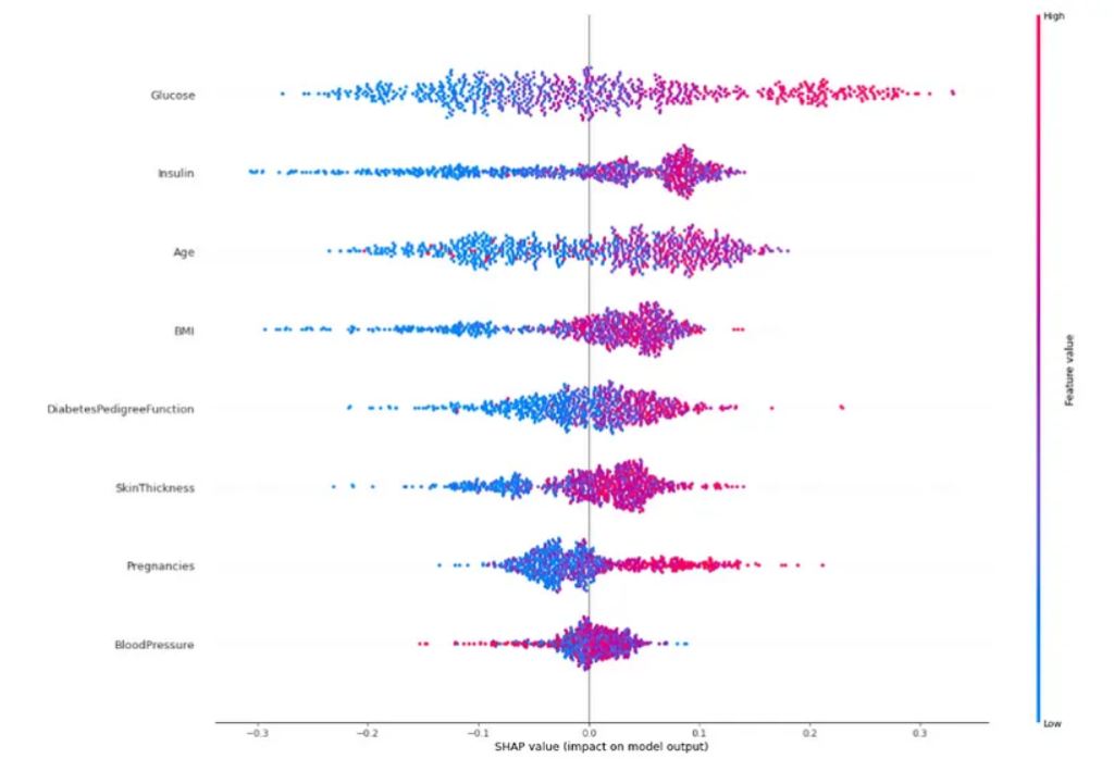
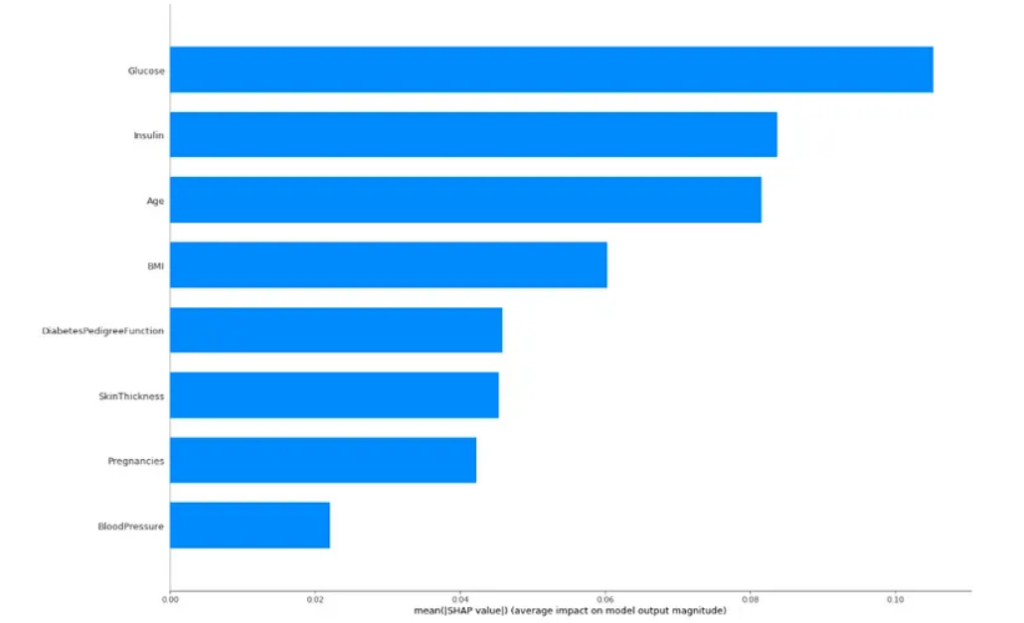
SHAP emerges as a tool capable of explaining, in a graphical and intuitive way, how artificial intelligence models arrive at their results. Through the interpretation of the graphs, it is possible to understand the decision-making in Machine Learning in a simplified manner, allowing for explanations to be presented and knowledge to be conveyed to people who do not necessarily work in this area.

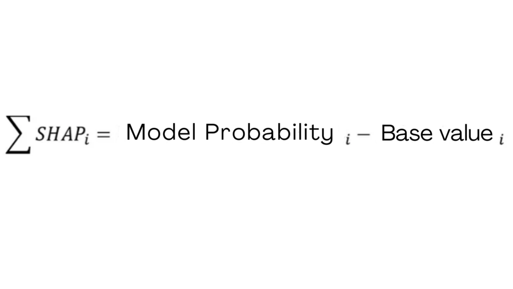
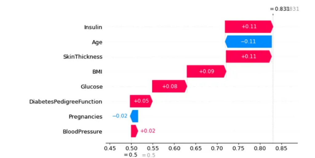
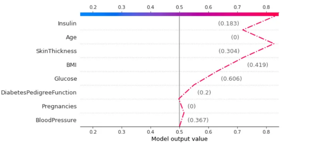
Throughout this text, we were able to assess the key concepts about SHAP values, as well as their visualizations. From SHAP values, we understand how the values of each variable influenced the model’s outcome. In this case, we evaluated the results in terms of probability. Analyzing the visualizations, it was possible to perceive that SHAP allows us to interpret specific and individual results, as well as understand what the scheme expresses about the problem.

Despite the robust mathematics, understanding this methodology is simpler than it seems. The SHAP technology does not stop here! There are many things that can be done with this technique, and that’s why I strongly recommend:

  1. Reading their documentation.
  2. Evaluating other model interpretation methods in my notebook on Kaggle.

Do you want to discuss other applications of SHAP? Do you want to implement data science and make decision-making more accurate in your business? Get in touch with us! Let’s schedule a chat to discuss how technology can help your company!

Written by Kaike Reis.

Didn’t find what you were looking for?

Get in touch with our team (786) 558-1665 or send an email to [email protected]. If you prefer, click here and schedule an appointment.

299 Alhambra Circle, Suite 403
Coral Gables, Florida 33134

(786) 558-1665

[email protected]