When we talk about advertising, it is very important to know how many people will be reached by the ad, mainly to guarantee that the investment made will be reverted in profit. No wonder a 30-second Super Bowl halftime ad can cost around $5.6 million. The more people see the advertisement, the greater the number of people who will adhere to the product being advertised.
In this text, we will explore this theme thinking about the fictional context – which could be real – of a bicycle rental company, which is planning to implement an electronic panel in its stations, with weather and traffic information, which will also have spaces for advertisements.

Photo by Ross Sneddon on Unsplash.

Our goal will be to find out which are the busiest seasons and times so that the company can plan the installation of the panels in the most profitable way possible, and also have a price guideline to sell the advertising space according to the time of day.
For this, we will work with a database on bike sharing in Austin and apply knowledge of machine learning and data analysis, in Python, to know and predict the movement in the stations.
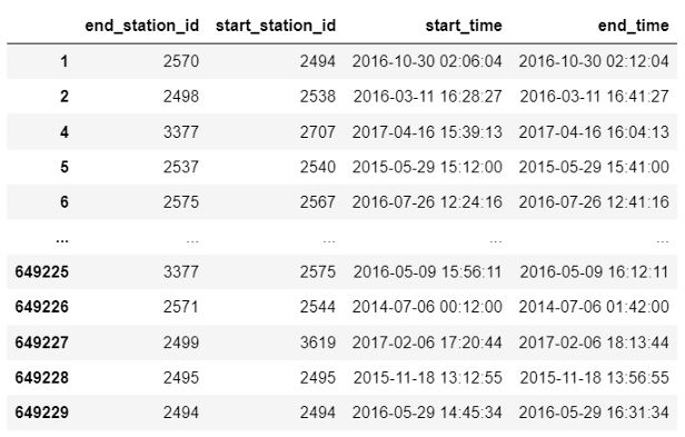
On this basis, we have data from bicycle stations – such as location, name, id, and whether it is active or not – and also data from trips made – such as duration, start, and end stations -. So, we’re going to create a solution that learns from old travel information and, with that, can indicate how the seasons will move in the coming months.
Processing and analyzing the data
Before starting the machine learning project, we need to analyze and treat our database. Opening the files in some data editor, such as Excel, we can make some comments:
- In the base with travel data, the fields ‘start_station_id’ and ‘end_station_id’ have an unnecessary decimal place;
- There are rows with empty values for ‘start_station_id’ and ‘end_station_id’;
- There are inactive stations (status ‘closed’) and stations that have moved (status ‘moved’);
- As we are going to predict the movement of each season, there are fields that we are not interested in. We will only use ‘end_station_id’, ‘start_station_id’, ‘start_time’, and ‘end_time’.
So let’s solve these problems! Using Python, we can handle our database:
					import numpy as np
import pandas as pd
import matplotlib.pyplot as plt
of date and time import date and time
from datetime import timedelta

station_csv = pd.read_csv('./austin_bikeshare_stations.csv');
trips_csv = pd.read_csv('./austin_bikeshare_trips.csv');

## raising dataframe only with active stations
station_active = station_csv.query("status != 'closed' & status != 'moved'")

trips_temp = trips_csv.copy()
trips = pd.DataFrame()

## removing lines that have null 'end_station_id' and 'start_station_id'
trips_temp = trips_temp[(np.isnan(trips_temp['end_station_id']) == False) &
                        (np.isnan(trips_temp['start_station_id']) == False)] #dropna

## enlarging a more compact dataframe and removing the twelfth place of ID
trips['end_station_id'] = trips_temp['end_station_id'].astype('int');
trips['start_station_id'] = trips_temp['start_station_id'].astype('int');
trips['start_time'] = pd.to_datetime(trips_temp['start_time']);
trips['end_time'] = trips['start_time'] + pd.to_timeplus(trips_temp['duration_minutes'], unit='min');

## filtering the dataframe to only count trips that started and ended at active stations
active = active_stations['station_id']
trips = trips.query("end_station_id in @active & start_station_id in @active");
With this, we managed to assemble a more compact base, with the data that interests us:
However, as we want to analyze the movements in the stations, we can still improve this modeling. Then, we will create a data frame focusing on the movements.
					movement = pd.DataFrame()
movement['station_id'] = trips['end_station_id'].astype('str')
movement['year'] = pd.to_datetime(trips['end_time']).dt.strftime('%Y')
movement['month'] = pd.to_datetime(trips['end_time']).dt.strftime('%m')
movement['day'] = pd.to_datetime(trips['end_time']).dt.strftime('%d')
movement['hour_of_day'] = pd.to_datetime(trips['end_time']).dt.strftime('%H')

temp_movement = pd.DataFrame()
temp_movement['station_id'] = trips['start_station_id'].astype('str')
temp_movement['year'] = pd.to_datetime(trips['start_time']).dt.strftime('%Y')
temp_movement['month'] = pd.to_datetime(trips['start_time']).dt.strftime('%m')
temp_movement['day'] = pd.to_datetime(trips['start_time']).dt.strftime('%d')
temp_movement['hour_of_day'] = pd.to_datetime(trips['start_time']).dt.strftime('%H')

movement = movement.append(temp_movement, ignore_index=True)
movement = movement.sort_values(['year','month','day'])

Finally, we have a suitable data model for what we need. Now we can generate some graphs to analyze the data and draw conclusions about bike rentals.

Movements in the seasons where the columns in yellow symbolize Summer and those in reddish pink, Autumn. The blue and green columns represent Winter and Spring respectively.
From the temporal view of movements, we can identify when there is an increase in the number of rents. We can also see that the movement of the stations has increased over the years.
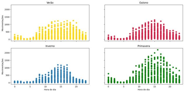
Again, the graphics in yellow symbolize summer, and those in reddish pink, autumn. The blue and green graphs represent winter and spring, respectively.
With these scatter plots, we can clearly see that the movement is concentrated in the afternoon and early evening hours. We also see that spring is the season of the year when there are more movements.
With this vision, we have already managed to create a guideline for how much to charge for advertising space according to the time of day.
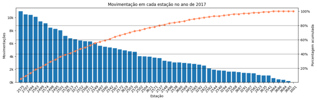
Movement in each season of the year in 2017.
In this last graph, we were able to identify the stations that concentrate certain percentages of the total movements. We can see, for example, that the station’s IDs 2575, 2707, 2494, and 2563 concentrate almost 20% of the total movement.
This analysis is important for us to notice the busiest stations and, therefore, plan the installation of the panels strategically. As 80% of the movement is concentrated in approximately half of the stations, it might not make sense to install the panels in the other half, as their contribution is low.
Forecasting movement in the coming months
Now that we’ve explored the database, we can use the data to predict how rents will move over the next few months.
As we saw from the graphical analysis that the number of movements is greatly influenced by the date, season, and rental point, we will use the fields ‘station_id’, ‘month_start’, ‘month’, and ‘season’ as features of our model.
					db = movement.query("station_id in @top80_stations")
db = db.groupby(['year','month_start','month','station_id'], as_index=False).count()
db['station_id'] = db['station_id'].astype('int')
db = db.drop(columns='hour_of_day')
db['month_start'] = db['month_start'].apply(datetime.toordinal)
seasons = [1,2,3,4] # winter = 1, spring = 2, summer = 3, fall = 4
db['season'] = db['month'].apply(lambda x: seasons[int(np.ceil((x+1)/3)-1)] if x != 12 else 1)
db = db.rename(columns={'date':'count'})
Now that we have the foundation complete, we still need to separate the training and testing data. We will use data prior to 2017 as training and test the model with data from this year.
To predict movements, we will use the scikit-learn library, widely used in machine learning projects. In our case, we will do the modeling with the RandomForestRegressor() method. This algorithm has several hyperparameters that can be tuned for better performance. In our case, the only one that we will declare will be the n_estimators (number of trees), with the value of 100.
Just like that, we created our movement forecast! We can see the result in the graph below.

Movement at each station over time with actual values in blue and predicted values in yellow.
With sklearn’s metrics, we can evaluate the performance of our model numerically:
MAE: 191.95
MAPE: 26.16%
r2 score: 0.72
The MAE (Mean Absolute Error) indicates an average for all error records between the predicted value and the actual value. MAPE (Mean Absolute Percentage Error) has a similar meaning, indicating the average for all records of the ratio between the error and the actual value. The r² score indicates the correlation between predicted and actual values (the closer to 1, the greater the correlation).
As we are dealing with a time series, we could obtain better results using specific prediction and modeling techniques for this type of data, as I discuss in this other text. However, knowing our data, with the metrics and the graph presented, we can conclude that, even if it is not perfect, our model is good enough to predict the movements in the rental stations.
So far, we haven’t explored anything beyond what we already know. So let’s expand the X_test base for the following months and thus obtain a prediction that indicates the movement until the end of 2017. We visualize this result in the following graph.
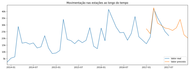
Movement at each station over time with actual values in blue and predicted values in yellow.
Thus, we were able to observe the behavior of movements in the coming months, which clearly follows the seasonal behavior of old data.
In addition to this visual result, with the prediction data in the following months, we have the absolute value of movements between August and December 2017 must be around 130 thousand, only in the stations that concentrate 80% of the movement.
Turning data into information
With what we have worked on so far, we can draw some relevant conclusions for planning the installation of electronic panels:
- The movement is concentrated in the afternoon. So renting advertising space can be priced higher between 12:00-18:00.
- In spring, the bike stations are at their busiest. Advertising space can also be rented for a higher price at this time of year.
- We have a list of bicycle stations sorted by the number of movements. Installing the panels can be done in that order to ensure a faster payback. In addition, with the installation carried out in about half of the stations, we already have an excellent range of total movements.
- We know that, over the next 5 months, the forecast is for around 130,000 movements at the rental stations, which concentrate 80% of the movement. To hire companies that will use advertising space, this information is very relevant.
With that, we conclude our review of bike rentals. The complete code used in development can be accessed here.
Want to know more about how to use data technology to your advantage? Click here to contact our team of experts on the subject, we will be very happy to help!
This text was written by Laura Fiorini.