First, it is important to point out how we, from the BIX Tech team, have access to the data. All data is extracted through an open API (application programming interface).

We do some data processing and delete unused fields with the extracted data.
After extracting and transforming, we load the data into Power BI.
Then comes the beautiful part with visuals and colors that make your report look better and useful to anyone who uses it. Well, if a report isn’t useful, it’s no use being pretty, is it?
Enough of the ramblings and let’s show you what matters most.
Have you ever needed to check if a specific sales target was reached? Right below in Figure 1, we have a comparison of Actual vs Budgeted, which is the first page of our report.

The first highlight: with one click you can change from a sales analysis to a pipeline analysis.
All visuals on the page will be adjusted (automatically filtered) to show pipeline results in the place where sales were previously presented, as shown in Figure 2.

In this context, a good question arises: how do you have goal data if Pipedrive does not provide or make these fields available to be inserted?
And the answer is simple: with the Power BI tool, we can consolidate different data sources in the same report and best of all, we can report them so that they make sense in our reports. In this example, we use a .csv file to import the budget data, but it can come from a SQL database or an Excel file.

The second cool highlight is the tooltip on the graph over time.
When you hover the mouse over the visual in any month, a tooltip will open informing at the top of the values of the accomplished, the goal, and the achieved percentage of the actual vs budget. And in the donut chart, the data for that month was broken down by Type of Sale, as shown in Figure 4.

The third highlight is in the detail. A button at the top of the clustered bar graph, Figure 5.

Clicking on it will take you to a detail page as shown in Figure 6. This breakdown can be used even with filters applied or not on the Actual vs Budgeted page.
This button takes you to a detailed table with customers, products, date of sale, and value information. Here, an important note is that the date of sale will be shown when the key is in sales, when the key is in pipelines it will show the date of creation of the deal.

Through the side Menu, we can navigate between the pages of the report, so let’s navigate to the Deals Analysis report as shown in Figure 7.

As its title says, this report page shows the company’s deals data. Tracking how much we won from deals, how much we lost, and how much is still open.
The fourth highlight is, when we select a sales executive by clicking on its name, we end up filtering all report visuals with data from that sales executive, as seen in Figure 8.
Providing a quick analysis to the user, where he will know how much that executive lost in sales, how much he still has to sell, and how much he has sold!

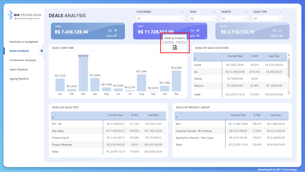
Clicking on the “Detail by Products” button will take you to a detail page as shown in Figure 10. This breakdown can be used with filters applied or not to the page.

Our fifth highlight is the meaning of Win Rate, it is the percentage of valid deals closed in a specific period that were won.
In the table below, there is a breakdown of Deals by-products, allowing the user to discover the best-selling products in a given period, as well as lost or open ones.
Remember that Power BI allows the user to perform filters with a click on a row in a table, or a column in a column visual, and all the visuals on the page will adjust to the filter applied.
Still, on the Deals Detail page | Product, we have a button to further detail the Deals table by Products.

By clicking on it, we will be taken to an analysis of the share of the products, that is, a percentage that shows how much a sale of a single product represents of the total sales, total losses, or total open deals.

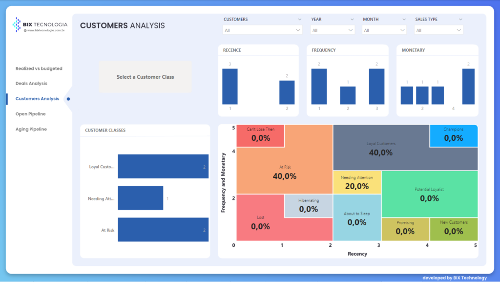
The RFM classification provides a broad analysis of the status of the active customer portfolio, through a dashboard.
The idea is to know who the company makes the biggest sales to, how often these customers buy, and how many days have passed since their last order. This analysis brings several benefits to the management of the company, among them: helping to focus the company’s efforts on the most important customers. After all, the best customer is the one you can count on buying one or more times a month, and still placing high-value orders, right?
If you are interested in knowing more about the RFM classification, leave a comment on this article, and we might create another one further discussing this analysis.

As in the other pages, we always make it easy for the user with a quick and easy access detail using a button. On this page, the button is intuitive as it informs you that it is possible to detail a class of clients by selecting a class in the visual of classes of clients. After selecting it, the button will be enabled and then we just have to click on the button that has the following sentence: Detail Customers.

On this page, we inform the customer’s name, the R, F, and M score, the product bought, the quantity, the date of sale, and the value.

The seventh highlight goes to the follow-up of your company’s open deals.
We were able to analyze by sales types, sales groups, sales executives, and sales funnel, whether in the graph or the table.
Through the side menu, we will navigate to the last page of this report in Power BI, Aging pipeline, as shown in Figure 17.

The last page of our report shows us all open deals over time, whether by quarter, by month, or by year. It is possible to generate insights for sales growth in the current month, or the next months or quarters, among other possible analyzes to be done with this information.
That’s it for today, I hope that after this article, it has become a little clearer about the capacity of the Power BI tool, and its applications.
Do you see possible scenarios on how to integrate these demos into your organization? Click here and let’s connect and continue the conversation.